Pansy in Paperback

At the height of her popularity Isabella’s books were published in several languages and sold all over the world.

She had a large fan base in England, and in the 1890s a British publisher took the unusual step of publishing Isabella’s novels as pamphlets. Today, we’d call them paperback books.

Cover of Four Girls at Chautauqua. Printed in color with Victorian-era borders and flourishes. A central illustration shows three young women dressed in gowns and bonnets of the 1890s on the deck of a boat. Two of the ladies are seated while the third stands facing them. In the background other people stand at the railing and look out over the water at the coastline in the distance.

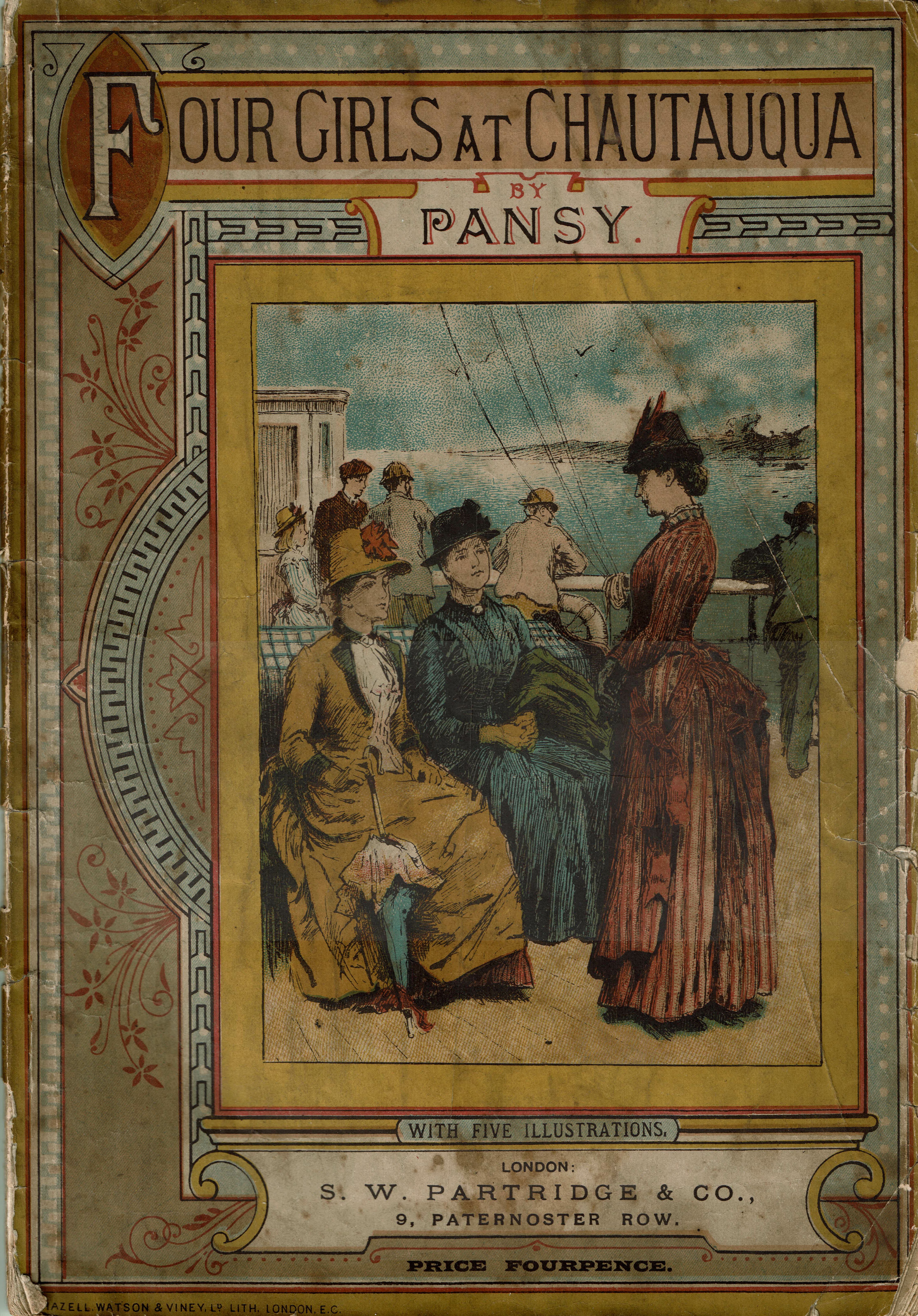
S. W. Partridge & Co. of London advertised the books as “Partridge’s Cheap Pansy Series.” Each edition included a list of the available titles in the series:

A portion of the front matter contained in the books announcing Partridge's Cheap "Pansy" series at fourpence each. Other books in the series:
Mrs. Solomon Smith Looking On 
Links in Rebecca's Life
Chrissy's Endeavour
The King's Daughter
Ester Ried
Ester Ried Yet Speaking
Ruth Erskine's Crosses
Chautauqua Girls at Home
Three People
Wise an Otherwise
An Endless Chain

The novels measured 7-1/2” by 10-3/4”, making them slightly smaller than the 8-1/2 by 11” standard paper Americans use today. They were only 64 pages long, but thanks to their 2-column layout and small type, each novel was complete and compact enough to fit into a lady’s bag.

Page one of Four Girls at Chautauqua. The text is formatted in two columns in small type.

In fact, Partridge & Co. published them particularly for women travelers. They were sold at newsstands in railway stations throughout England and cost just four pennies.

A portion of the cover of Four Girls at Chautauqua, showing the price of the book: fourpence.

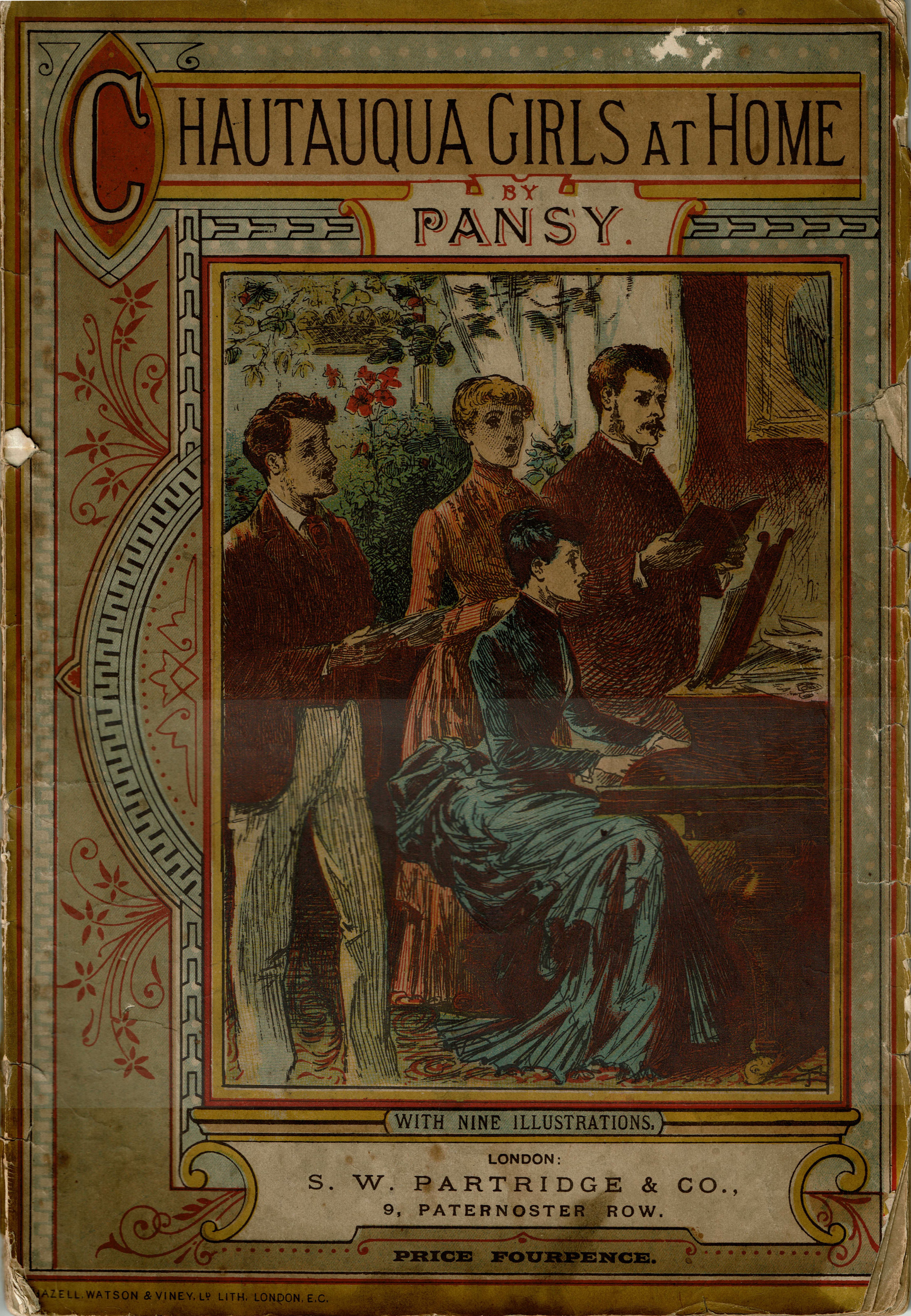
Each book featured a beautifully embellished, full-color cover that illustrated a particular scene from the story. Here’s the cover for Chautauqua Girls at Home:

Cover of Chautauqua Girls at Home. Printed in color with Victorian-era borders and flourishes. A central illustration shows a young woman seated at a piano, playing and singing. Standing behind her are a young woman and two young men, each holding music books and singing.

The cover art for Ruth Erskine’s Crosses shows the moment Ruth’s father introduced her to Judge Burnham.

Cover of Ruth Erskine's Crosses. Printed in color with Victorian-era borders and flourishes. A central illustration shows an older man in coat and hat introducing a young woman to an older man who is in the process of removing his hat. In the background are two other women. One is removing her coat while the other unties the cords on a large box.

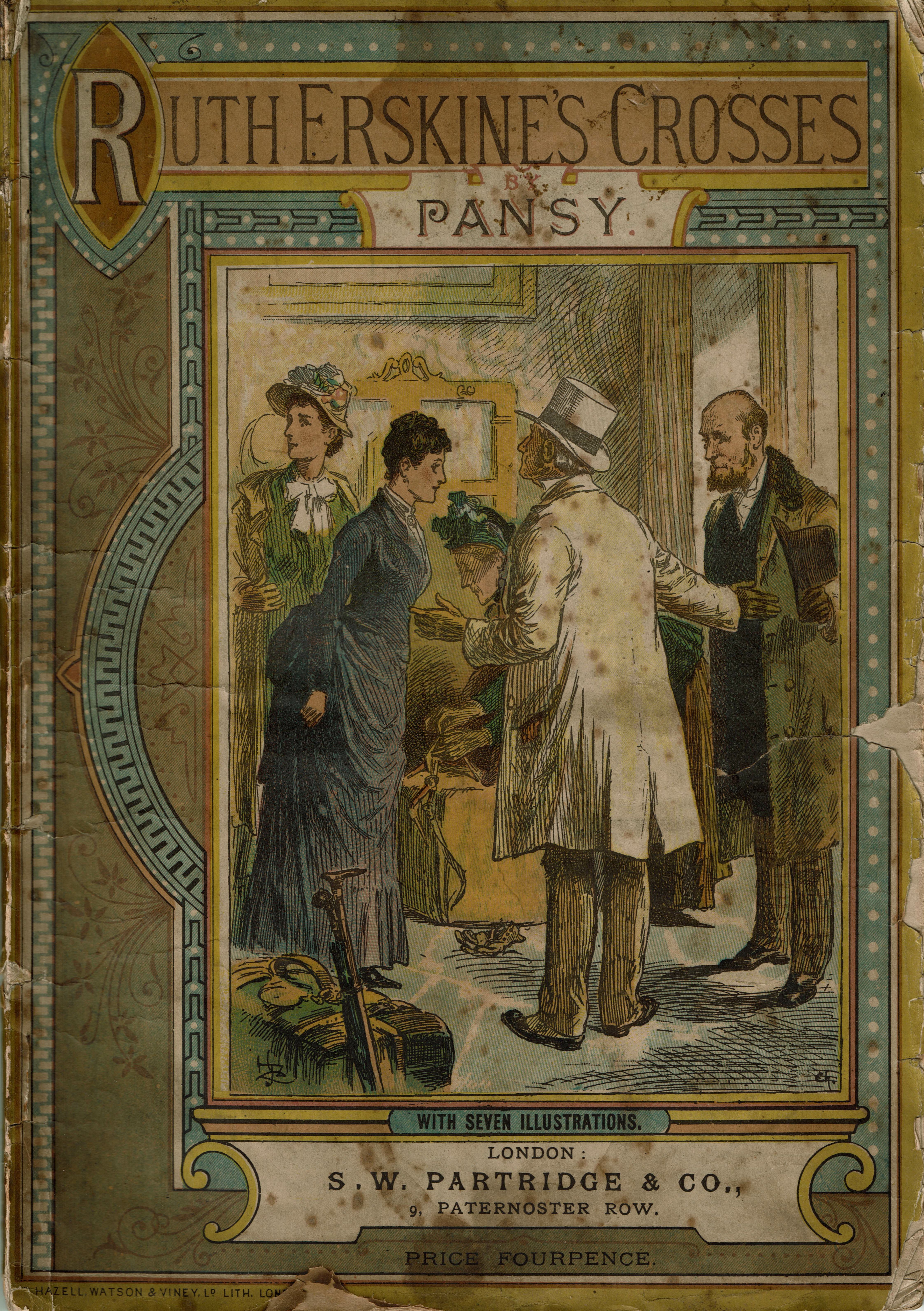
What do you think of the depiction of this important scene? Is that how you pictured Judge Burnham when you first read Ruth Erskine’s Crosses?

The cover for Julia Ried shows the moment Julia went to apply for the bookkeeping job at the box factory.

Cover of Julia Ried. Printed in color with Victorian-era borders and flourishes. A central illustration shows a young woman dressed in coat and bonnet and carrying a parasol. She has just entered a room and her hand is still on the doorknob. She faces an older man dressed in a suit with a watch fob and chain in the pocket of his waistcoat. The room he is in contains boxes, a table with books on top and shelves with large books or bound ledgers.

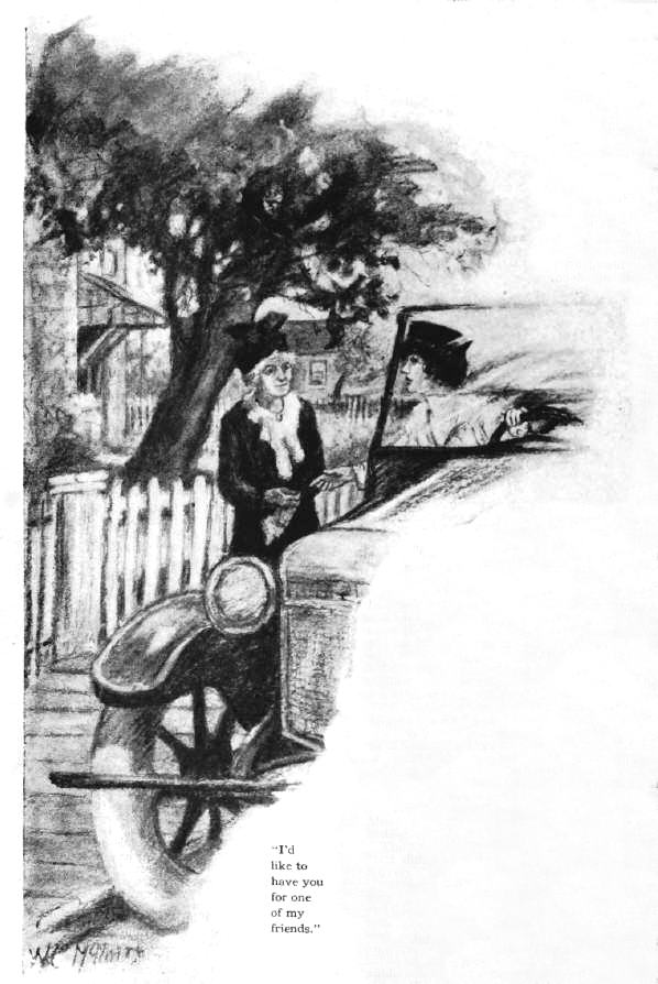
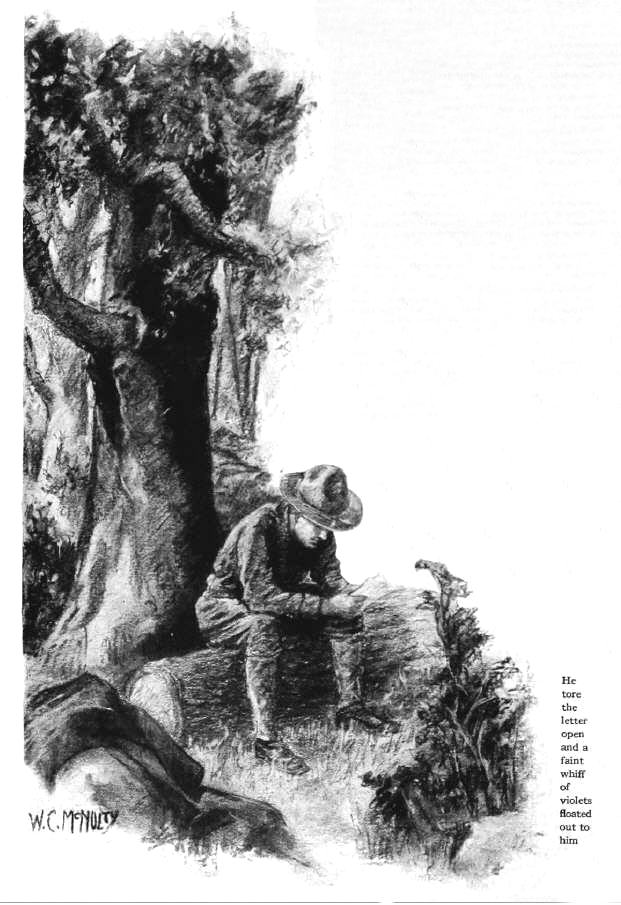
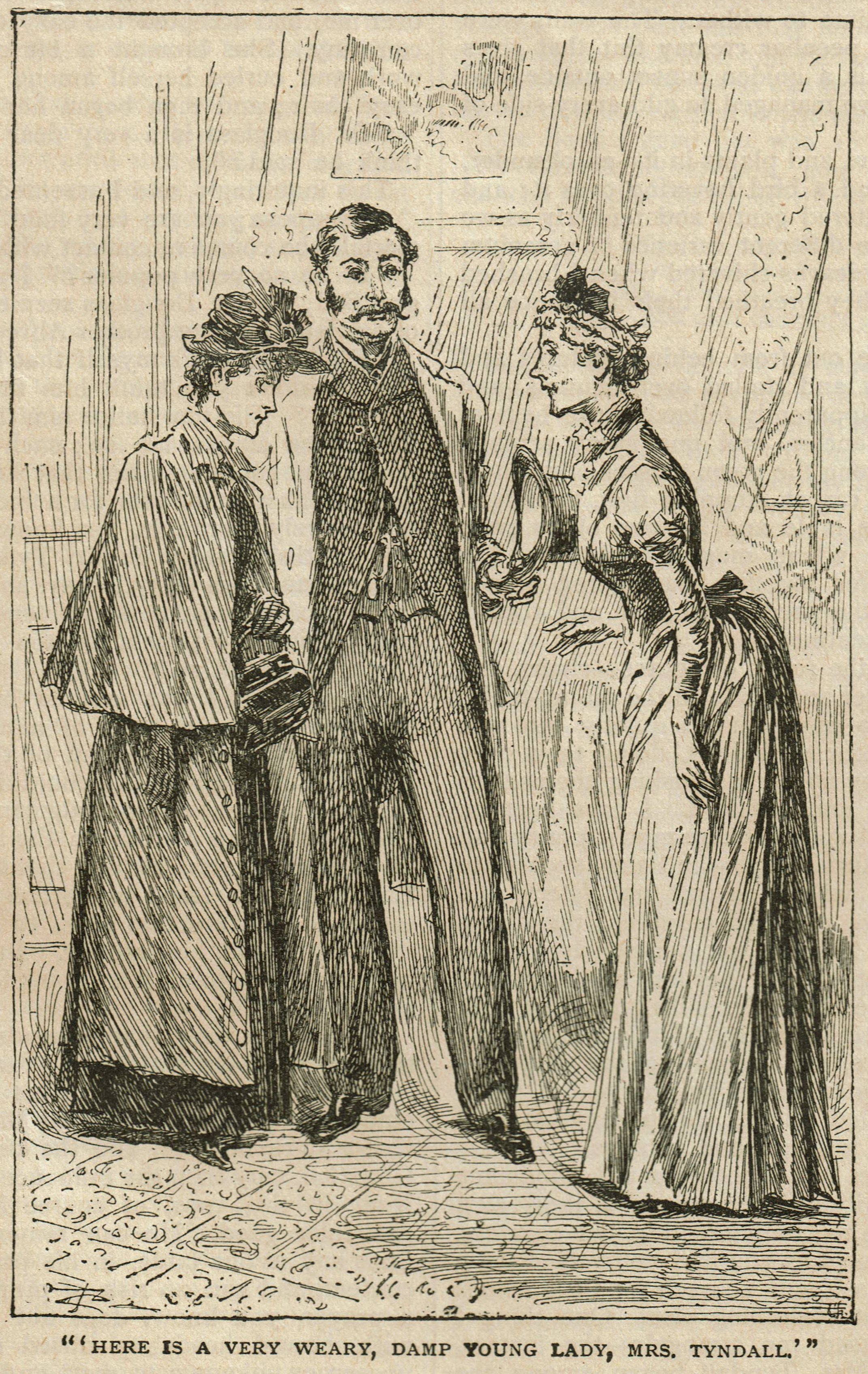
In addition to the cover, each book had anywhere from five to nine black and white illustrations. This one, in Julia Ried, depicts the moment Dr. Douglass introduced Julia to Mrs. Tyndale.

Illustration of a man in 1890s clothing introducing a young woman wearing cape and bonnet to an older woman who is wearing a fashionable gown and a cap.

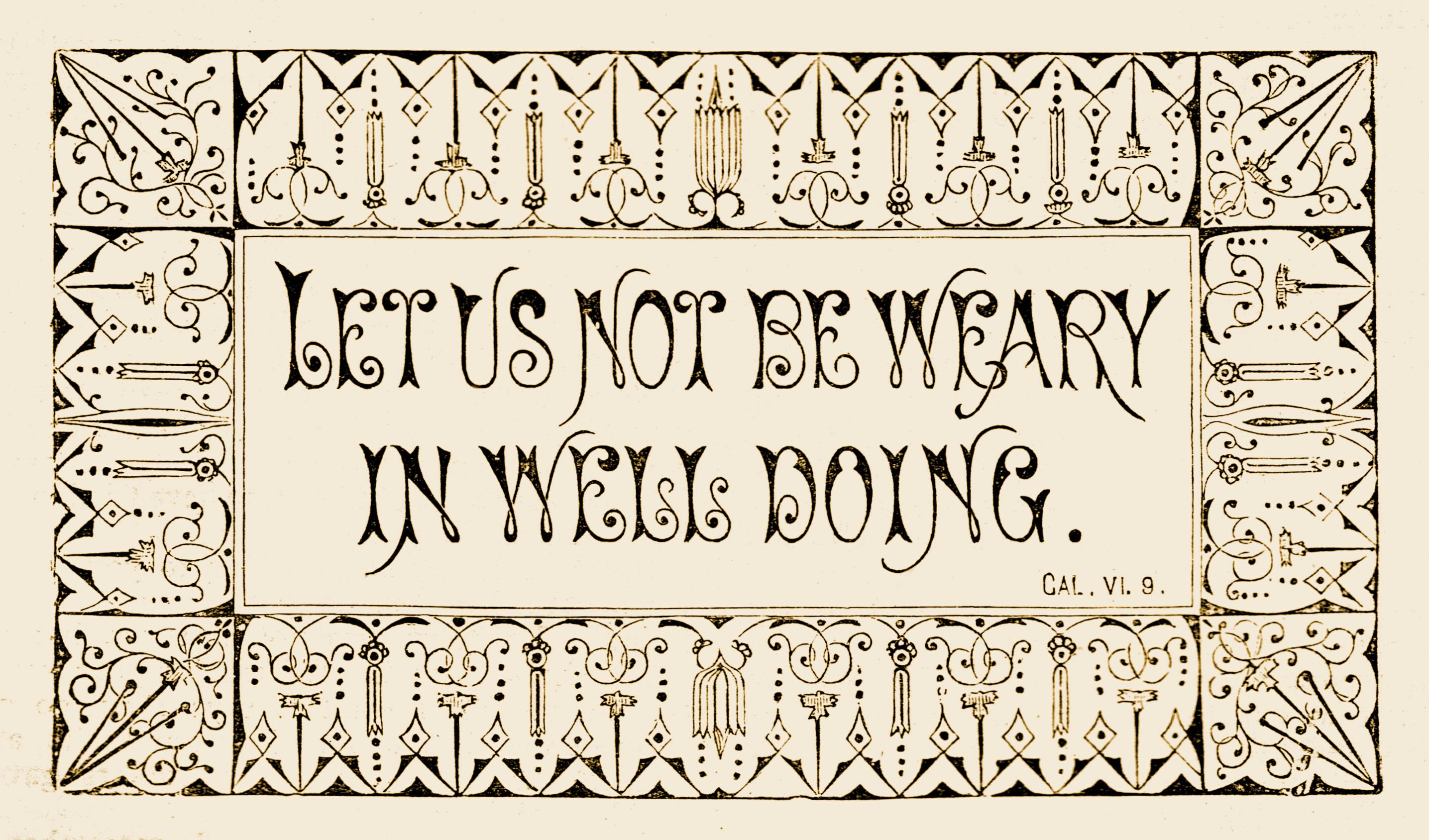
Mottos were very popular in the 1890s, and this motto appeared at the end of Julia Ried:

Your faith should not stand in the wisdom of men, but in the power of God. (I Cor. II. 5.)

It very nicely sums up one of the lessons Julia learned in the story.

Often, mottoes like this one were used as inexpensive sources of artwork. Ladies cut them from the pages of books and magazines and pasted them into scrapbooks or framed them to hang on the wall.

Cover of Ester Ried Yet Speaking. Printed in color with Victorian-era borders and flourishes. A central illustration shows a young girl sitting on the floor beside a vase holding two white flowers.

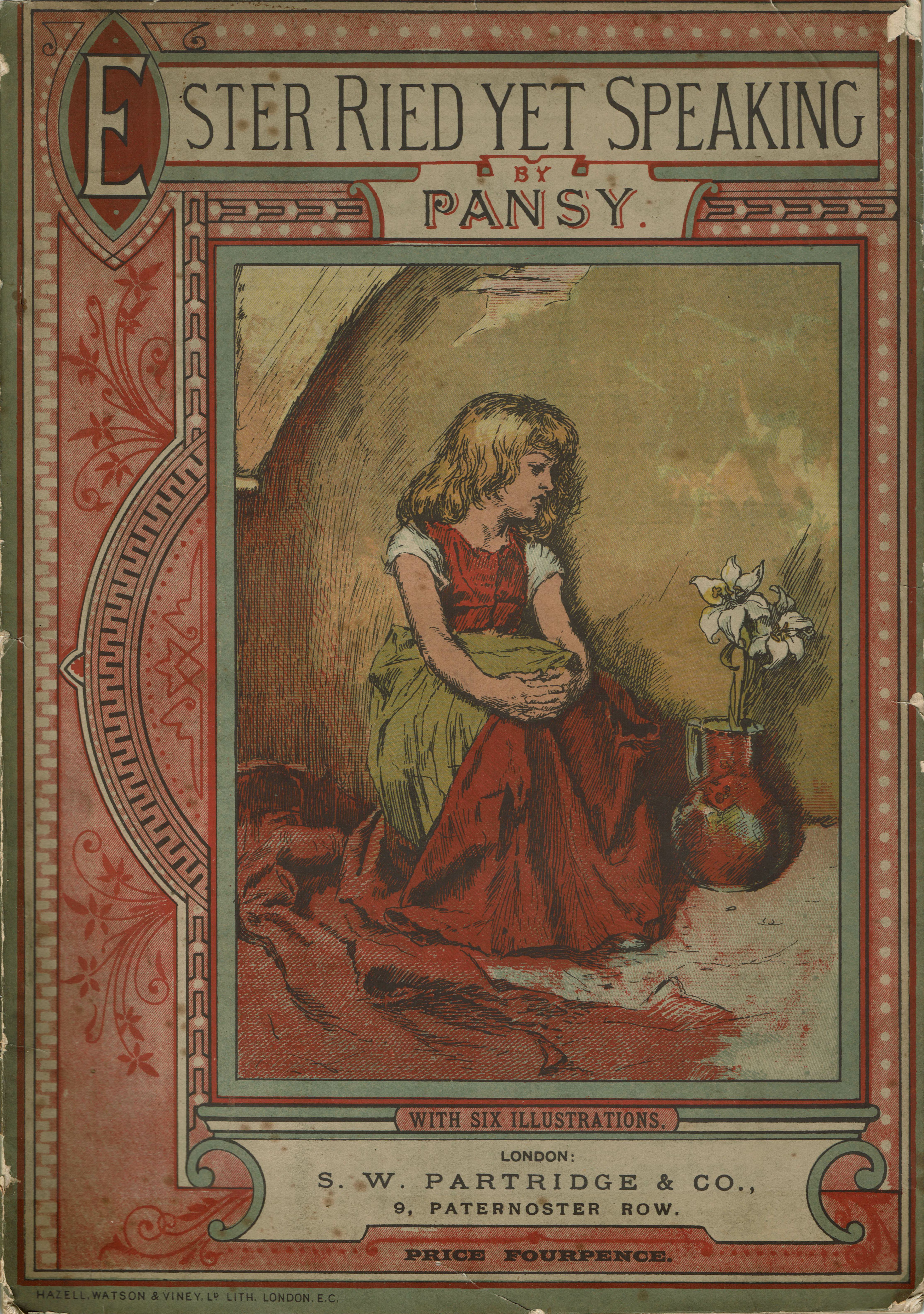
Ester Ried Yet Speaking also ends with a motto related to the story:

Let us not be weary in well doing. (Cal. VI. 9.)

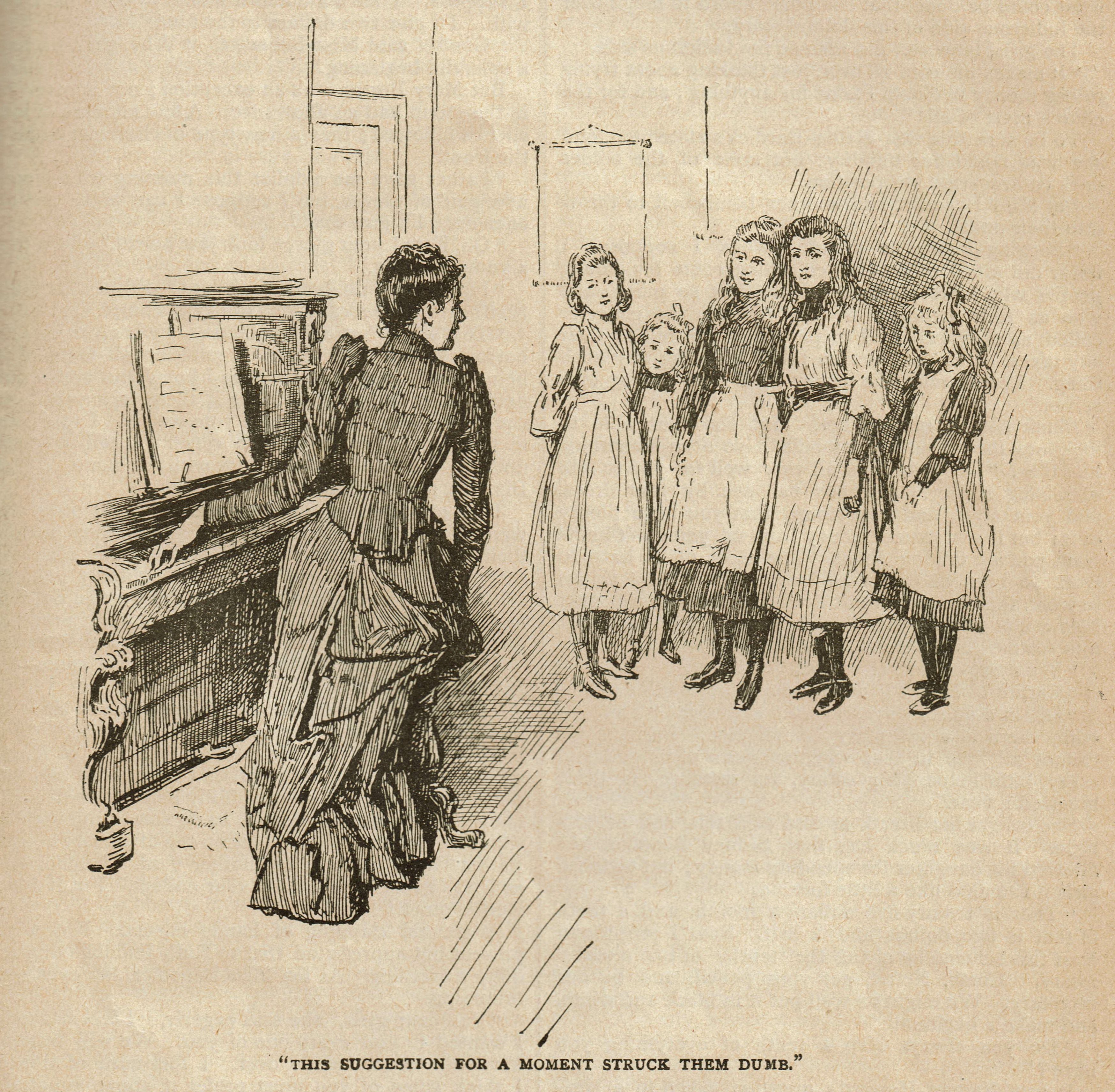
The cover for Interrupted illustrates the moment Claire Benedict learned her father’s money was gone and the family was bankrupt.

Cover of Interrupted. Printed in color with Victorian-era borders and flourishes. A central illustration shows a young woman dressed in black facing three men who are seated, each holding their hats and walking sticks. Beside the young woman is seated an older woman also dressed in black.

One of the black-and-white illustrations shows the moment Claire suggests to her students that they take on the job of cleaning up the church sanctuary:

Illustration of Claire seated as the piano, one hand on the keyboard, but she has turned slightly to face five girls who are standing nearby. Caption: "This suggestion for a moment struck them dumb."

It wasn’t uncommon for the titles of Pansy’s novels to be changed when they were published in other countries. One Commonplace Day was one such novel; in England it was renamed Wise to Win:

Cover of Wise to Win. Printed in color with Victorian-era borders and flourishes. A central illustration shows a young woman and young man conversing in a parlor or living room. In the background are two women, one standing and one seated at a table near a fireplace.

These paperback books all have some wear and tear, but considering the fact that they’re over 130 years old, they are in remarkably good shape. Perhaps they’ll last another hundred years for a new generation of Pansy readers to enjoy!

What do you think of these paperbacks?

Do you have a favorite cover?

Click here to read a previous post about mottos.

The Older Brother … Illustrated!

Have you read Isabella’s novel, The Older Brother?

It’s the story of a young man named Lawrence Hammond. Just before his father died, Lawrence promised he would always care for his mother and younger brother and sister, just as his father did before him.

“My dear children,” it began.

But Lawrence had a dream. More than anything, he wanted a college education, but in the days following his father’s death, he put that dream on hold because his family needed him.

As time passed, Lawrence’s skill and hard work began pay off. The family farm began to prosper and it finally looked as though Lawrence’s dream of going to college just might become a reality.

Just then, though, the family’s needs called for another sacrifice.

Suddenly, Lawrence was forced to ask himself a difficult question:

Did he have the strength to once again postpone his own heart’s desire for the sake of the people he loves?

“How would you like to change places with me, Port?” He had tried to make his voice sound careless.

The Older Brother is a touching story of faith and family duty. An 1898 version of the novel is available on Amazon and other e-book retailers.

But we recently found an earlier version of the book, which included the lovely illustrations shared here.

“Engaged!” exclaimed Mamie. “How delightful! Now we shall have a wedding.”

The artist was George T. Tobin, who often worked in pencil and ink in his younger years.

His wonderful illustrations capture the essence of some of the key scenes in Isabella’s novel.

Have you read The Older Brother? What did you think of the story?

Did you think Lawrence was right to sacrifice his own aspirations for his family?

You can click on the Amazon stamp below to learn more about The Older Brother by Isabella Alden.

The Search by Grace Livingston Hill

Isabella’s niece Grace Livingston Hill kicked off 1919 on a high note.

That was the year Grace’s novel The Search was published as a serial in a popular Christian magazine. The first chapter appeared in the January 1, 1919 issue.

Here’s the announcement the magazine ran the month before to notify readers about the upcoming serial (click on the image to see a larger version).

Although it’s fun to discover Grace’s stories in early newspapers and magazines, it’s even better when they’re accompanied by illustrations by the leading artists of the day.

John Cameron’s eyes met those of Ruth Macdonald. (From chapter 1 of The Search by Grace Livingston Hill.)

Artist William Charles McNulty (whose pieces are included in collections at The Metropolitan Museum of Art) illustrated three scenes from The Search for the magazine.

“I’d like to have you for one of my friends.” (From Chapter 3 of The Search by Grace Livingston Hill)

McNulty’s illustrations add a rich sense of time and place to the story, from the old-fashioned automobile Ruth drove, to the characters’ clothing, and the quiet place John found (in chapter 4) to read Ruth’s letter.

He tore the letter open and a faint whiff of violets floated out to him. (From chapter 4 of The Search by Grace Livingston Hill)

Later that same year, The Search was published in book form by Lippincott, and was well received by Grace’s fans; but the magazine version remains special, because of its illustrations.

If you haven’t read The Search, you’re in luck! You can read the e-book for free on your tablet, phone, Kindle or computer!

Amazon.com offers the e-book book at no charge. Just click on the banner below to begin reading:

.

Helen Lester

Isabella Alden’s first novel, Helen Lester, was published in 1865 when she was 24 years old.

The original book included a few illustrations. This one depicts the moment in the story when Helen’s older brother leads her to the Christ.

Helen Lester was a great success and launched Isabella’s writing career, but it almost wasn’t published!

You can read more about how Helen Lester came to be—-and read the book for free! Just click here.